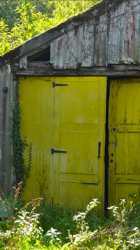
what goes with chartreuse
 ) hello and happy friday! i don’t know about you but i’m not sure where the week went. it whizzed by at lightning speed. one of the good things about blogging is that it helps keep track of the days like a log. one of the bad things is that it shows what an obsessive compulsive personality looks like!

(173599760607893452) i fell into the trap again today, spending more time playing than working so far this morning. but what i’ve come to realize is that it will all get done no matter how you arrange the hours.
(23925441742692309) so my little indulgence was again a challenge for me, taking a color i normally shy away from in decor and checking out how it’s used creatively indoors and out: chartreuse

(38702878020666976) a little touch goes a long way

(38702878020666959) and if you can take it, it’s a lot of fun. but it’s a weird color to pinpoint. it straddles between green and yellow, natural and neon

(23925441743110695) below is coco chanel’s apartment where she used an apple tone on her pillows

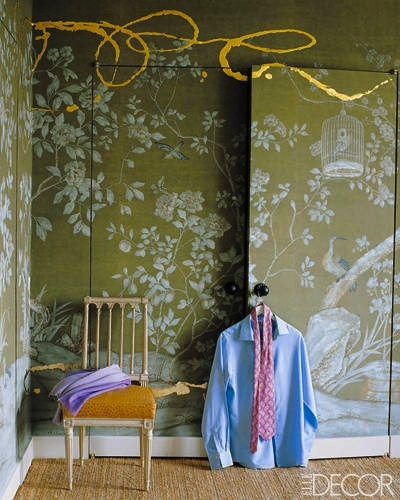
(228205906090555498) sometimes it can lean toward garish
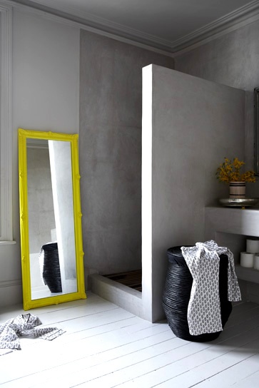
(38702878020666955) the vanity in this bath is what i believe is true chartreuse


(228205906089582174) or maybe it’s this ceiling trim…

(58054282666090380) but of course there’s artistic interpretation

(38702878020666910) it’s a very bold choice in decorating but for those who take the plunge the reward is great!

(228205906088210722) this little pillow is enough for some!

(58054282666087060) but i see how accents can brighten up the place

(58054282666087056) another great choice for a DIY as an entry chest color

(173599760606803219) or again, in a piece of art
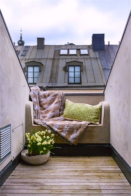
(183662491025747124) maybe take it outdoors

(23925441742943529) it works with almost every color from red to turquoise

(58054282666087073) and we’re certainly not the first ones to love it!


and if there’s ever any doubt of it’s timeless chicness, we can always turn to the french who apparently have been using it for years. below at versailles. go figure!

well i hope you enjoyed today’s colorburst. now off to work for real! have a great friday!
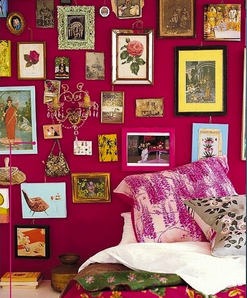
what’s so hot about pink

good morning! it was fun putting a blue story together yesterday and i wanted to challenge myself with a color today that i’d normally never use in decorating: hot pink.

(outdoor-spaces) but as they say, never say never! i’m falling in love with the creative ways people have been using now, in the past and in nature.

this photo was done by Dani Bennett who turned the classic peacock blues into a pink fantasy in photoshop!

(249809110552789071) what really amazed me is the bold choices that were used on doors all over the world. paris here

(242068548693299806) greece

california maybe?but then, if you have a front door, why not play with it every year…or even season? it’s about the quickest way to change the look and feel of a house.

as for the color itself, it fits in just about anywhere and can set a different tone in each room.

it’s daring

cozy

(161637074097203863) vivid

228205906087872749 inviting

le-bath sophisticated

unexpected

(southshoredecoratingblog) strong

timeless


surprisingly neutral

cheerful
bold

and just plain fun to play with

(68721859813) a fun DIY
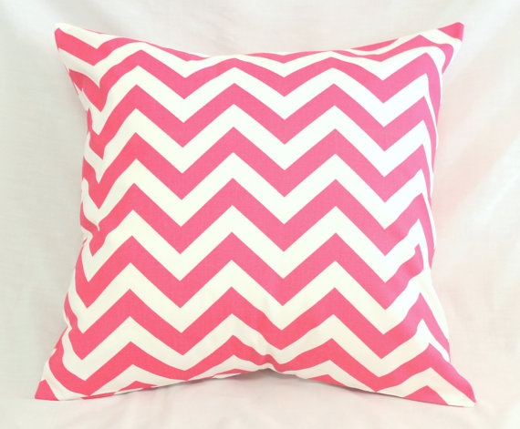
(95983035779005199) on a pillow
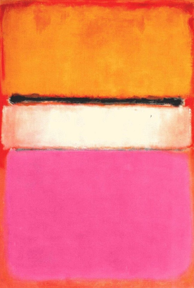
or artwork

pinterest.com/parisapartment/art

i think you have to really love it to go this crazy but hey, it’s only paint!


at the minimum, just get that flash of freshness, nothing beats a beautiful bougainvillea! well i better get going, the crew is here, have a a perfectly pink day!
all photos can be found on pinterest here: http://pinterest.com/parisapartment/boards
a little bit blue

good morning! it’s still pretty early but time is just flying by. maybe i should block pinterest till after work cause even a cursory glance turns into a photo fest!
so much comes in at hyperspeed and before you know it, you’re half an hour deep in the vortex.

with that i’m sharing some of my favorite shots and in an effort to hone it down and create a theme. today’s inspiration is simply: deep blue.

(fleurs) it’s a color i don’t use much and am starting to wonder why.

(le-bath) a little tile goes a long way in a bath


(kitchens) or a kitchen
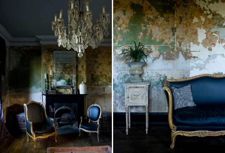
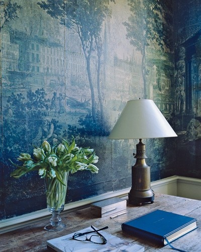
(le-chateau) on a silk satin sofa or small leather chair or on a velvet daybed


(bars) on an accent wall behind a bar

somewhere between indoors and and out

(doors-and-windows) and a touch or outdoors is always cheery!


(pin/192740059025047144) even as solar roof tiles!
and a little goes such a long way.
well now i’m officially late but it was fun to slack off and surf this morning! hope you enjoyed it. have a beautiful blue day!