what goes with chartreuse
 ) hello and happy friday! i don’t know about you but i’m not sure where the week went. it whizzed by at lightning speed. one of the good things about blogging is that it helps keep track of the days like a log. one of the bad things is that it shows what an obsessive compulsive personality looks like!

(173599760607893452) i fell into the trap again today, spending more time playing than working so far this morning. but what i’ve come to realize is that it will all get done no matter how you arrange the hours.
(23925441742692309) so my little indulgence was again a challenge for me, taking a color i normally shy away from in decor and checking out how it’s used creatively indoors and out: chartreuse

(38702878020666976) a little touch goes a long way

(38702878020666959) and if you can take it, it’s a lot of fun. but it’s a weird color to pinpoint. it straddles between green and yellow, natural and neon

(23925441743110695) below is coco chanel’s apartment where she used an apple tone on her pillows

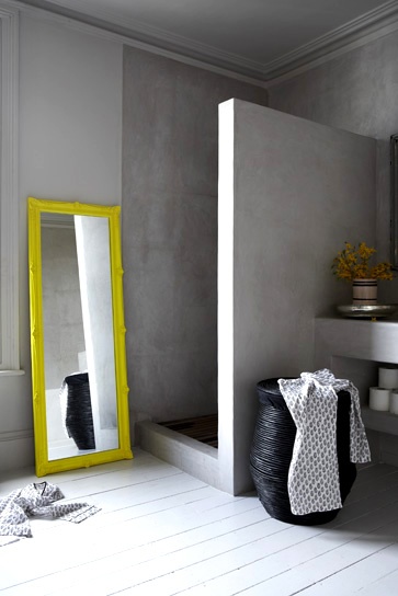
(228205906090555498) sometimes it can lean toward garish
(38702878020666955) the vanity in this bath is what i believe is true chartreuse


(228205906089582174) or maybe it’s this ceiling trim…

(58054282666090380) but of course there’s artistic interpretation

(38702878020666910) it’s a very bold choice in decorating but for those who take the plunge the reward is great!

(228205906088210722) this little pillow is enough for some!
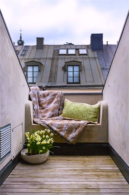

(58054282666087060) but i see how accents can brighten up the place

(58054282666087056) another great choice for a DIY as an entry chest color

(173599760606803219) or again, in a piece of art
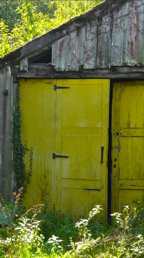
(183662491025747124) maybe take it outdoors

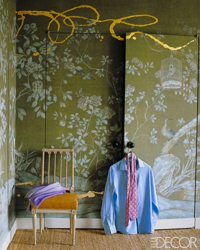
(23925441742943529) it works with almost every color from red to turquoise

(58054282666087073) and we’re certainly not the first ones to love it!


and if there’s ever any doubt of it’s timeless chicness, we can always turn to the french who apparently have been using it for years. below at versailles. go figure!

well i hope you enjoyed today’s colorburst. now off to work for real! have a great friday!


Dee Dee Mozeleski (@BubblesDeux) replied:
Eek! I gasped when I scrolled through this pics because they are all so stunning!
LikeLike
May 31, 2013 at 4:02 pm. Permalink.
Smalltown Me replied:
Lovely!
LikeLike
May 31, 2013 at 4:02 pm. Permalink.
Kim Biden "Vintage Addict" replied:
I kept scrolling to see more! Thank you! Will have to try this color now :)
LikeLike
May 31, 2013 at 4:05 pm. Permalink.
Anna replied:
Chartreuse goes with everything. I am.firmly convinced it’s a neutral.
LikeLike
May 31, 2013 at 4:09 pm. Permalink.
De replied:
Finally chartreuse! It’s been my go to color for years and often never mentioned in design! Thanks for your wonderful post.
LikeLike
May 31, 2013 at 4:17 pm. Permalink.
Peggy Braswell replied:
I agree with all the comments + chartreuse is one of my favorites to use in design.. xxpeggybraswelldesign.com
LikeLike
May 31, 2013 at 4:30 pm. Permalink.
MJH Design Arts replied:
Love the grayish chartreuse the best and mix with with coral accents–yum.
Great question.
Mary
LikeLike
May 31, 2013 at 4:52 pm. Permalink.
Suzanne replied:
Swoon!
LikeLike
May 31, 2013 at 7:19 pm. Permalink.
dakaara replied:
Beautiful … have a happy weekend :) !!!!
LikeLike
May 31, 2013 at 9:09 pm. Permalink.
Mom replied:
Well, that’s our new gazebo color. Who knew! I called it lime!
LikeLike
May 31, 2013 at 10:54 pm. Permalink.
Nikon replied:
So many amazing shots! The one of the Paris roof nook is my favorite.
LikeLike
May 31, 2013 at 11:32 pm. Permalink.
Ruby Lee replied:
I have to echo what others have said: the photos on your site really blow me away! thank you for posting, they are lovely.
LikeLike
June 1, 2013 at 4:22 am. Permalink.
Susan replied:
Oh I really really love these colour palettes, they have definitely struck a chord. Isn’t it funny, I have also been working with this very colour and the lovely pink you also showcased. Something is definitely in the air :-)
LikeLike
June 1, 2013 at 12:08 pm. Permalink.
Ming-Pei Cobb replied:
Love it……..!
LikeLike
June 1, 2013 at 3:35 pm. Permalink.
Clare replied:
Oooh! Loving it! Especially with vibrant purple hues.
Clare x
LikeLike
June 3, 2013 at 11:04 am. Permalink.
Merillion replied:
Hi Claudia,
Loved your chartreuse post. You’re right, it’s not an easy color!
Another color that I think is difficult to pin down is “purple.” It can be bluish, sometimes it’s pinkish – is it purple or not?
Marilyn
LikeLike
June 10, 2013 at 2:26 am. Permalink.
Carole replied:
Lov
LikeLike
June 12, 2015 at 9:17 am. Permalink.
Tabulous Design: Welcoming March, Looking At Chartreuse replied:
[…] (via) […]
LikeLike
March 1, 2017 at 12:01 pm. Permalink.
Mozee replied:
Many thanks really handy. Will share site with my good friends.
LikeLiked by 1 person
January 14, 2019 at 11:11 pm. Permalink.